The core Tales theme includes a unique stylesheet for Internet Explorer 7–8 that provides a semi-fluid desktop design (screenshot below).
The main CSS is loaded in partials/head.php using conditional comments:
<!--[if (gt IE 8) | (IEMobile)]><!-->
    <link rel="stylesheet" href="/assets/css/style.css">
<!--<![endif]-->
<!--[if (lt IE 9) & (!IEMobile)]>
    <link rel="stylesheet" href="/assets/css/oldie.css">
<![endif]-->
If you’d prefer, you can remove those lines and load CSS with wp_enqueue_scripts. Look towards the top of functions.php and uncomment these lines (or override with a child theme):
// global $is_IE;
// wp_enqueue_style('neko__css', get_template_directory_uri() . '/assets/css/' . ( $is_IE ? 'oldie' : 'style' ) . '.css', array(), NEKO__VERSION, 'all');
The downside of using server-side detection is that it’s unfriendly to any caching software running in front of WordPress. This is why the conditional loading is default.
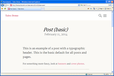
The screenshot above shows Tales in IE 7. IE 7–8 basically get the responsive design at the largest breakpoint which scales down to 1024px at its smallest. Optimising for smaller screens isn’t really necessary for old desktop browsers.