Tales is simple, minimal, and powerful. Below are some of its key features. Take a look at the Tales Demo to experience the theme in action.
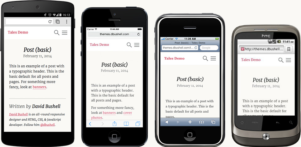
Responsive Design
Tales is a fully responsive WordPress theme designed to work across all browsers and devices. Whether it’s mobile, tablet, desktop, or something else, Tales will look just splendid.
Vector Graphics
For theme icons Tales uses SVG to ensure super crisp graphics on all high pixel density screens, including Apple Retina displays.
Theme Customisation
Tales integrates with the WordPress theme customizer to make small design tweaks a piece of cake. This is ideal for personalising your blog colours and fonts with the live preview. For truly unique designs use Tales’ advanced post header tool to create post banners and covers photos.
Translation Ready
Tales is compliant with WordPress localisation and comes with the necessary files ready for translation to any language. Translations included are English: en_US (default), en_GB; German: de_DE.
Get in touch if you’d like to contribute translations for future updates.
Browser Support
Tales uses progressive enhancement to offer a rich level of browser support, including basic fixed-width support for legacy Internet Explorer 7–8. The responsive design works on iPhone 3GS (iOS 3) to the latest iPhone 5 (iOS 7) and equivalent iPads. It has been tested back to stock Android 2.2.